
Monday, February 1, 2010

Frustration & Dynamic Movement

Have a final composition, once more my words were frustration and dynamic movement. I figured that traffic in a city is rather annoying and frustrating while the light streaks and faint look of shattered glass could manage the idea of dynamic movement. Here are the images I used in the composition above:
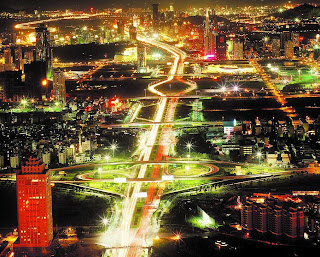
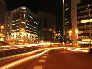
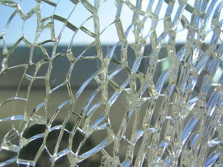
Still learning all the bells and whistles on Photoshop but I think I'm getting the hand of masking, filtering, & the eraser tool. All the other things like layering, brush tool, & lasso tool I just built up on from this class.

Can't wait till the next project!

Sunday, January 31, 2010

WoW


Just a life drawing of my roomate and her boyfriend playing World of Warcraft. I think I'm going to try and post something like this on a weekly basis just because...

Thursday, January 28, 2010

3 Iterations of Frustration and Dashing Movements


Here are 3 different iterations of the current composition project I am constructing using two words previously given to me.My favorite one out of these is the first one with all the traffic.

Wednesday, January 20, 2010

Interiors at UNCG

First rendering of the semester: select a public interior on UNCG's campus and fully render using any media on an 11x14 piece of paper. Interior must have at least 3 scale figures in the composition.

The interior I picked was the atrium under the dining hall. This is a perspective looking from the entrance to the Spartan Market. The media I chose to use was watercolor and colored pencils on watercolor paper. I chose to leave the people in the interior whited out so they still give a sense of distance and scale without detracting from the interior.

Estimated Time Taken: 6-7 Hours

Monday, December 7, 2009

SYTYCD: Final!


This was the final So You Think You Can Draw assignment, to make a CD with the other SYTYCD assignments burned onto it along with designing a cover for the CD. I did mine entirely on photoshop with text, gradient, & brushes. I though the quote was appropriate for this class especially.

Kitchen Boards


A comparison board on our kitchen project that goes into more detail of the design with axon views, plan views, section cuts, cabinet elevations, & exploded cabinetry. This was an exercise in laying a board out to fit your concept.

Thursday, November 19, 2009

Customize Your Island... Like a Puzzled City!

For the 12"x12" So You Think You Can('t) Draw, we had to do our custom piece in our studio kitchen as a focal point among the context of the kitchen. I fully rendered this so I could also use it for my board.

My greatest worry was about how dark the cabinetry is, but I think with the light walls and floors it looks just fine.